ROYAL CARIBBEAN
Streamlining the dining experience for Royal Caribbean Guests
Background
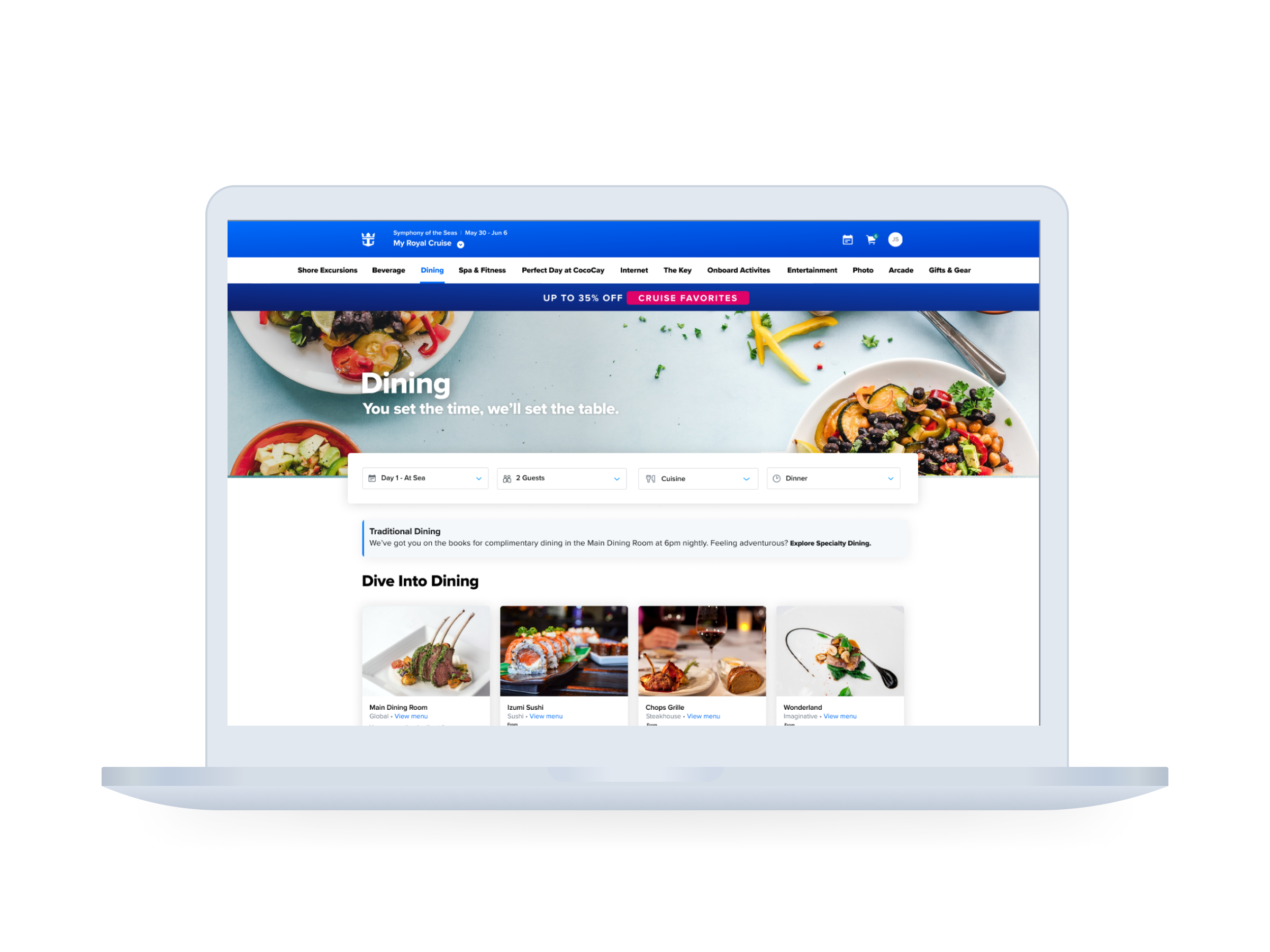
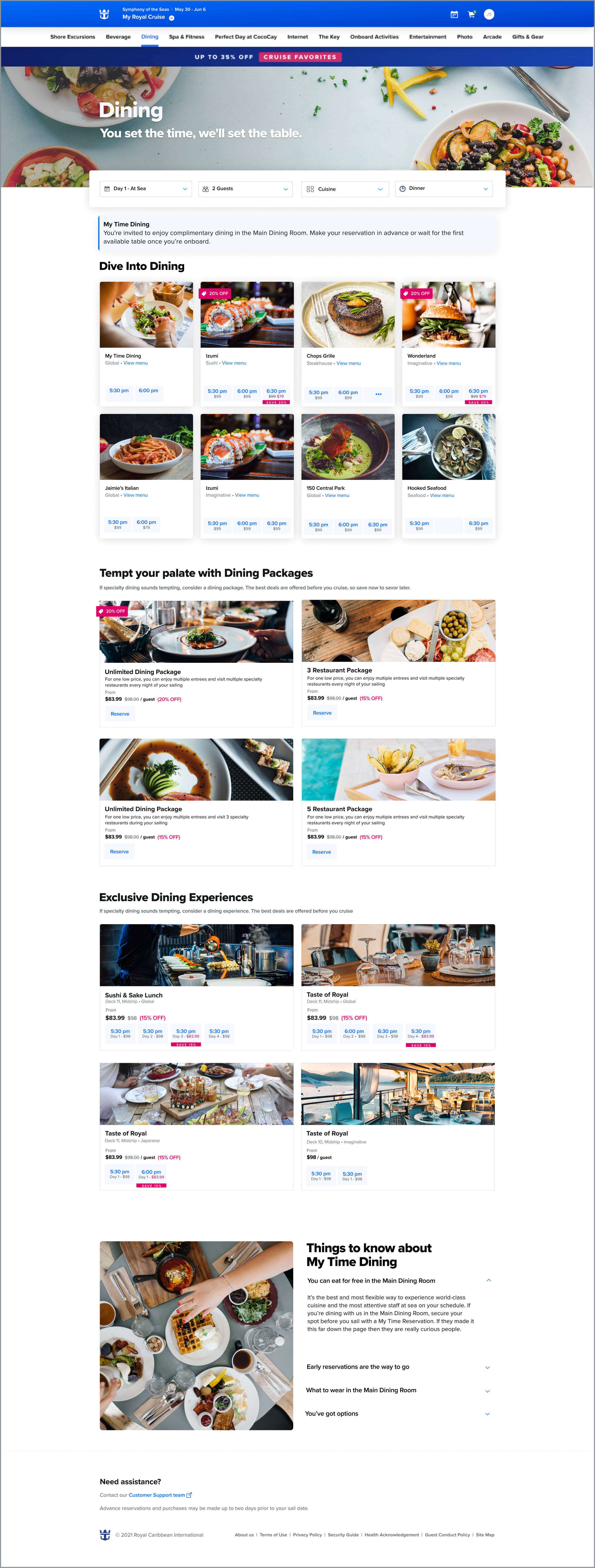
As the product designer, I led a consumer-facing modernization project to streamline Royal Caribbean's dining booking process. I focused on encouraging early reservations with clearer, visible times, reducing confusion around dining options like Specialty Dining, My Time, and Traditional Dining, and creating clear CTAs to guide new and experienced cruisers.
Background
This product would take the place of a soon-to-be deprecated intranet platform that served to connect, assist, and engage the global land based employees that support the massive cruise shipboard fleet . Shoreside represents all land-based employees; everyone at the global offices, from IT professionals, to sales, to janitors.
Along with functional features like news, a digital key and wallet, the shoreside crew app presented an opportunity to engage and involve the entire employee base by having diverse and inclusive content from all satellite offices. We wanted to create a product that encouraged employees to engage and see themselves reflected in the experience . Content strategy needed to be visited and reworked, and not just duplicated from the company’s intranet.
Clarifying the user flow
In conjunction with product leaders, I facilitated discovery and prioritization workshops to vet and pull user stories out of high level concepts at the start of agile sprints. Naturally, our team was not fully in agreement with the viability of all features.
These workshops helped us work to find middle ground, as I advocated for the user yet understood that we had obligations as a business. These sessions served as a starting point for streamlined artifacts such as site maps and user flows which informed the deliverables in our agile sprints.
Building a Design System
When I joined the Excalibur product team, I was jumping onto a speeding train. I connected with teams with more mature products to understand how the product I owned would fit into the ecosystem.
Along the way, each designer had the responsibility to audit the UI, vet patterns, and document them in our shared library. The design system was a living, breathing tool. View this more in depth.
Output
The following features were decided upon for our beta release: Home Feed, News, Resources, People Search, Meeting Scheduler, Ship Finder, Account.
These features ultimately allowed users to connect with one another, locate each other, access their career advancement portals, find their way to a meeting, schedule a meeting and more.
Under very tight deadlines, It was key to align very closely with QA and developers to make sure the builds matched the original intended designs. Through iteration, several stakeholder design reviews, a beta version was built and deployed over the course of my time at Royal.